Harness the magic of film-making with our guide to mastering color grading. Unearth the professional’s secret with these essential post-production tips.
Delve into the world of color grading and learn how every shade, tone, and tint can elevate your film to wholly new aesthetic heights.
The Artistry of Color Grading
Color grading (great post-production tips)—the fine-tuning of colors in each frame—transcends mere editing or correction. It’s an artistic intervention, a transformative process that beautifully blends technical precision with creative flair. Given the right touch, an effective color grading can elevate an ordinary project into an extraordinary visual feast.
Filmmaker Orson Welles once said, “Create your own visual style… let it be unique for yourself and yet identifiable for others”. In the realm of color grading, this message resonates profoundly. Your choices in color not only influence the mood and aesthetics of your film but can also breathe life into your unique visual style.
Set the Tone with Storytelling in Mind
Color grading is storytelling—a tool for filmmakers to communicate the mood and narrative of their story visually. From the desolate blue tones of a dystopian drama to the vibrant hues of a summer romance, color palettes are often the unsung heroes underlining themes and character development.
Consider films like “The Grand Budapest Hotel”. Director Wes Anderson uses a bubblegum palette to reflect the hotel’s elegance and spectacle. On the other hand, “The Matrix” uses green tones to highlight its computer-simulated world. These color choices directly impact the narrative and emotion the viewers perceive. They are also great post-production tips to put in your back pocket.
Begin with Balanced Footage
It’s essential to begin with well-exposed and correctly white-balanced footage. Properly balanced footage brings us one step closer to a final product that has the desired look and feel. Post-production tips: Always remember, excellent color grading starts at the moment of filming, not in post-production.
The importance of achieving correct exposure and white balance during filming cannot be overstated. High dynamic range, balanced lighting, and right white balance can significantly augment color grading efforts in post-production. For instance, using a gray card during filming can help ensure accurate colors in the final footage.
Understand Color Theory

Color theory forms the foundation of any successful color grading endeavor and is another essential in the post-production tips. Understanding the color wheel, color harmonies, and complementary colors can offer you a roadmap in the journey of color grading.
A comprehension of primary, secondary, and tertiary colors serves as the basis for color interaction, harmony, and the color contexts that build gratifying visuals. Harmonious color grading can affect the mood of your scene significantly, invoking specific emotional responses from viewers. For example, blue might evoke feelings of calmness, while red can trigger excitement or stimulation.
Utilize Color Grading Tools
There is a myriad of tools designed for Color Grading in the industry. Learning to effectively wield these tools can be your stepping stone to creating breathtaking visuals. Some of the most popular are Adobe Premiere Pro, DaVinci Resolve, and Final Cut Pro.
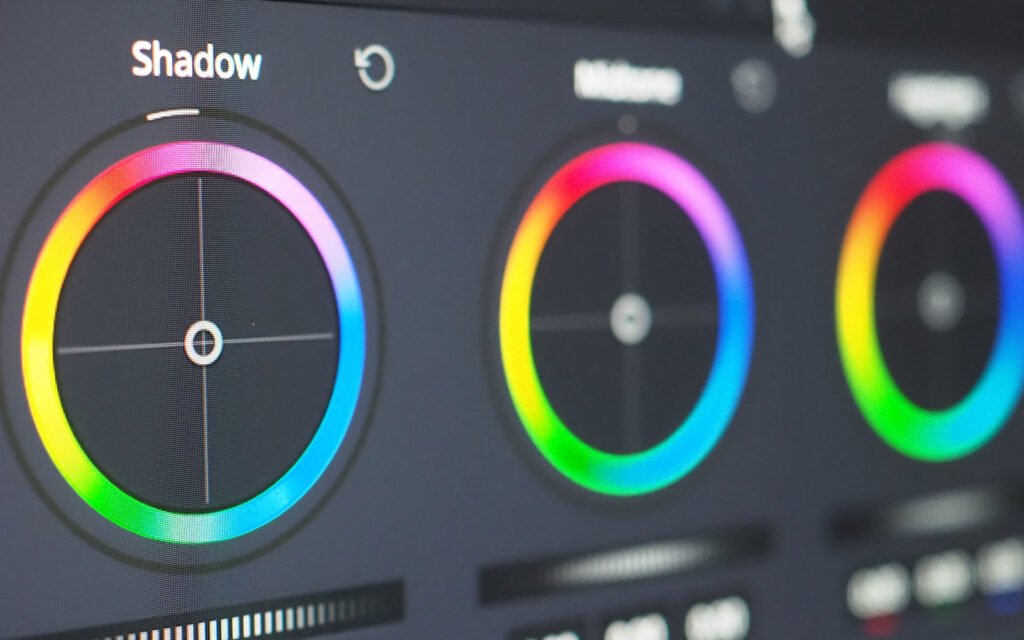
The color wheel, one of the most important tools for color grading, allows you to adjust the color of shadows, mid-tones, and highlights in your footage separately. Curves, another fantastic tool, helps create soft contrast and reminds us of the importance of color balance in every shot’s highs, mids, and lows. Histogram, yet another essential tool, helps maintain the ‘correction integrity’ during these adjustments. Understanding these tools and using them in tandem can make the color grading process faster and more intuitive, giving you the control you need.
Consistency Across Shots
Consistency is key when it comes to color grading. This demands ensuring that color grading is consistent across various shots. This can be challenging—particularly when shooting in different lighting conditions—but with the right strategies, you can achieve uniformity in your color grading.
Start by identifying a reference shot—a shot where the color and tone are exactly as you want them. Then, use this reference shot to match your other shots. The process might be laborious but remember—the devil is in the details. And these details can make or break your film.
Enhance Visual Depth
Filmmaking is the art of storytelling through moving images. But merely recording movements isn’t enough. Post-production tips: Adding depth and dimension to the frames makes them aesthetically appealing and engaging to watch. Color grading can be an effective tool for doing so.
Play with contrast and colors to create separation within your frame. A plain outdoor shot can be made interesting by darkening the background and highlighting your subject. Consider color grading not just as a tool for enhancing colors but also as a tool to guide your viewers’ eyes.
Embrace Subtle Adjustment
In color grading, less is often more. While it might be tempting to make dramatic shifts in color, such drastic changes can make visuals seem unnatural. Embrace subtlety and make small adjustments to get the most out of your footage.
Every story has its unique emotion and mood. Subtle color adjustments can enhance these emotions and moods, giving depth to your storytelling. Subdued color grading can make a dramatic story more intense, while vibrant grading can make a comedy feel light-hearted and fun.
Pay Attention to Skin Tones
One of the trickiest parts of color grading involves handling skin tones. Maintaining natural-looking skin tones is critical to ensuring that your characters look realistic. However, this can be tricky, particularly when you’re trying to create a specific mood with your color grading.
Start by using the Vectorscope tool, which helps you locate and correct skin tones, and focus more on getting accurate color representation than on creating art. Also, don’t forget that different races have different skin shades. Representative and accurate color grading can make your film more inclusive and realistic.
Test on Various Screens
Given the array of devices available today – with varying screen resolutions, sizes, and display technologies – you must ensure that your color grading looks consistent across all possible viewing platforms. Have you ever noticed how a movie can look vastly different when viewed on a smartphone, compared to a movie theater screen? This disparity is down to the characteristics of the display technologies.
To overcome this, test your color grades on several different display types. This could be anything from a smartphone to a high-grade editing monitor. By doing so, you will get a better idea of how your movie will appear on different devices and can modify your color grading accordingly. There are also dedicated tools available for this, such as color management software that can emulate how your project will look on different screens.
Seek Feedback and Iterate
The process of mastering color grading is an ongoing journey, one that requires plenty of practice, experimentation, and learning. You’re not expected to get it right on the first go. When you feel confident about your color grading, seek feedback from peers or mentors.
Remember, constructive feedback can reveal blind spots and provide fresh perspectives. Critique is a vital component of growth — it fuels your progress and pushes you forward. After receiving feedback, don’t hesitate to revisit your color grading work and refine it. This iterative approach can help you make significant strides in mastering the art of color grading.
That's A Wrap!
Mastering the art of color grading can be a long journey, but it’s one well worth undertaking. It’s an essential skill for creating hauntingly beautiful visuals that tell your story the way you envision. From understanding color theory to ensuring consistent color grading across shots, each step you take in mastering this art will be a step closer to bringing your unique visuals to life.
As renowned French film director Jean-Luc Godard once said, “Cinema is the most beautiful fraud in the world.” With your tools in hand and these tips in your toolkit, you’re ready to create your own delightful deceptions in the realm of color, making your viewers feel a multitude of emotions with every frame.
Throughout this journey, remind yourself that no masterpiece was ever created in a day. Be patient with your progress and devoted to your practice. The world of color grading is rich and wondrous. So, take the plunge and explore – frame by frame, and color by color.


